It's The Economy.
Was the 2008 crisis the worst since the great depression?Here's a plot of the Dow Jones Industrials Average from 1900 to 2021.
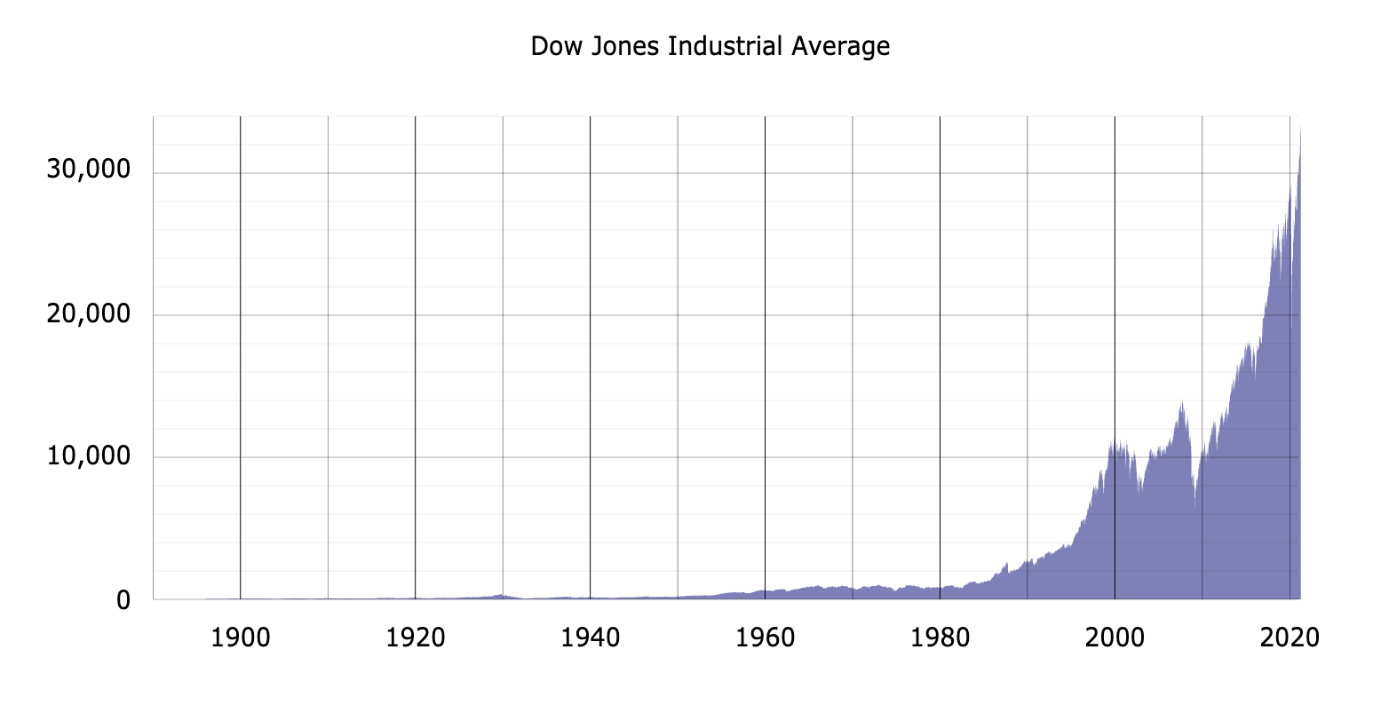
Because the economy has grown so dramatically over the last century, the
above plot conveys very little information prior to, say, about 1980. A
semi-log plot, as shown below, conveys much more information.
Note that a drop from 10,000 to 1,000 would be a 90 percent drop.
Similarly, a drop from 1,000 to 100 would also be a 90 percent drop. On a
semi-log scale both drops would look to be of the same magnitude.

A semi-log plot gives an accurate representation, but it lacks punch because
a factor of 2 gain corresponds, for example, to a rise from the 10,000 line to
the top line of the chart, which is not a very big vertical increment. The
same is true for a drop to a level 1/2 of a starting value. To put the
punch back
into the chart, we return to a linear scale but we normalize the DJIA by
dividing by both consumer price index (cpi) and world population.
The idea is that dollars are relative and therefore
it is necessary to scale things
into constant dollars---hence the division by the cpi. Furthermore, as the
world population grows, the economy grows proportionately, hence we also need to
divide by population to give a per-capita view. Finally, the vertical scale
has been normalized so that 1.0 is the average value from 1900 to present.
Here's the plot.

Many well-known trends are clearly shown in the above plot. Things were great during the roaring 20's followed by the stock market crash in 1929 and the ensuing Great Depression. It is generally acknowledged that World War II brought an end to the Great Depression, but what we see here is that the robust recovery didn't really get underway until the mid-1950's. That boom lasted until the mid-1960's, when the war in Vietnam and unrest at home took a toll on the economy. The slump from 1965 to 1980 was almost as severe, although not as precipitous, as the Great Depression. The Reagan-era boom started in the early 1980's and continued through the 1990's cultimating in the dot-com bubble that burst near the turn of the 21st century. After the dot-com bust, we had a minor boom (mainly in the energy sector) followed by the dramatic decline of 2008. During the Obama and the Trump years, the market improved steadily. At the far right we can see the sharp dip caused by the Covid-19 pandemic followed by a recovery that we are currently in. Whether that recovery lasts or not is yet to be seen. Currently the normalized index is about 3.00, which suggests that the economy might be significantly inflated from where its long-term average suggests it should be.
To answer my original question, it does indeed seem that the decline in 2008 was the worst since the Great Depression---in both magnitude and speed. But, it looks like we recovered from it much more quickly than we did from the Great Depression.
What's the Point?
The point of all of this is that most, dare I say all, of the exponential rise in markets over the years can be explained by two simple facts: (1) the world population is growing and (2) we seem to have a penchant for devaluing the dollar by printing more and more of them. One could argue that the DJIA is a bad measure of the economy, that world population should perhaps be replaced with US population (or developed countries population), and/or that the cpi is a flawed metric for inflation. All may be true. But, that's not the point. The point is that there are two main drivers for market growth: inflation and population. Correct for these and you can gauge where we stand at any point in time relative to a fairly objective average.
Finally, for those who want to see a semi-log plot of the normalized returns,
here you go:


This
work is licensed under a Creative Commons
Attribution-ShareAlike 2.5 License.