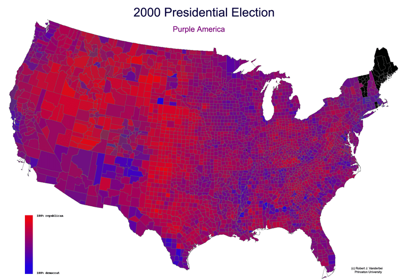
Using County-by-County election return data from USA Today together with County boundary data from the US Census' Tiger database we produced the following graphic depicting the results. Of course, blue is for the democrats, red is for the republicans, and green is for all other. Each county's color is a mix of these three color components in proportion to the results for that county.
Alaska, Hawaii, and the New England states are missing because the data from USA Today doesn't match the county data from the US Census. For example, the New England states' election return data is given for each municipality and/or district rather than for each county. Hence, it couldn't be easily matched with the county boundaries.
Click on map for a larger version.

Note: Here's an article by political scientist Philip Klinkner on America the purple: click here
Here's a red/blue map showing how things were displayed before this purple map was made... https://en.wikipedia.org/wiki/2000_United_States_presidential_election#/media/File:2000prescountymap2.PNG