
|
|
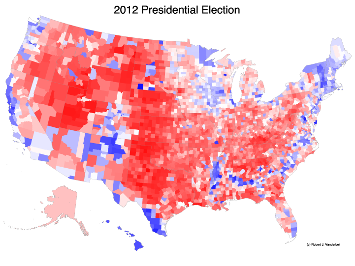
Posted: Wednesday, November 7, 2012, 11:42 am
Here is how America looks today:

Click on image for full-size version.
Posted: Sunday, November 11, 2012, 7:42 pm.
Updated: Tuesday, November 13, 2012, 8:52 pm.
Updated: Wednesday, November 14, 2012, 10:16 am.
Here is a tilted 3D version:
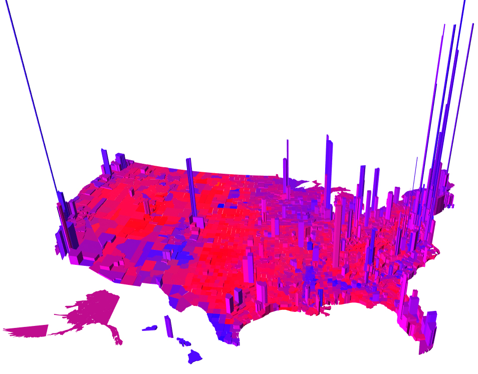
Click on image for WebGL 3D model (it's a 55 Mb file).
Posted: Wednesday, November 7, 2012, 7:21 pm
Here's how America has changed in 4 years:

Posted: Monday, November 12, 2012, 6:45 pm
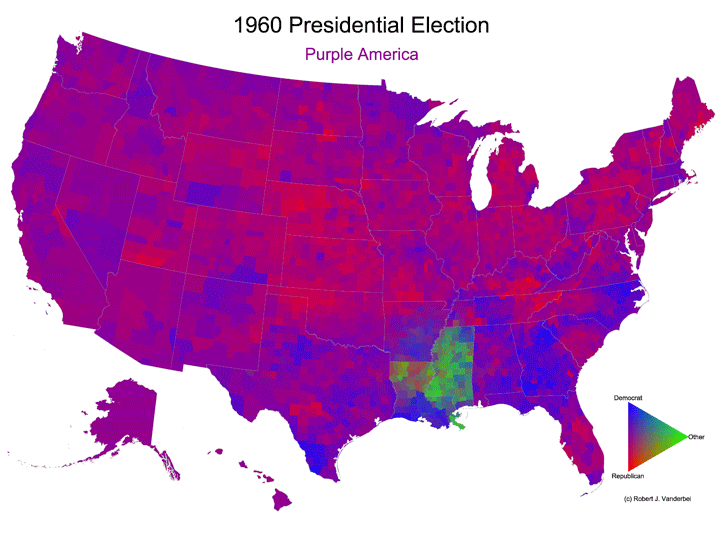
For those who want to know if their county tilted slightly red or slightly blue,
here's a red/white/blue version of the map:
Click here to buy T-shirts, coffee mugs, posters, and buttons from Cafe Press.
The maps above are misleading in the sense that sparsely populated areas are
shown no differently from densely populated areas. Manhattan has 1.6
million people but is only represented by the smallest dot in these maps.
Montana, on the other hand, has less than a million people but gets a huge chunk
of the map---as big as Montana.
Mark Newman
is well-known for his cartograms---maps that are
distorted in proportion to population. Here's Mark's map for the 2012
election:
http://www-personal.umich.edu/~mejn/election/2012/.
Click here for Election 2016 maps.
Click here for Election 2008 maps.
Click here for Election 2006 maps.
Click here for Election 2005 maps.
Click here for Election 2004 maps.
Click here for Election 2000 map.
All images on this website are licensed under CC BY 4.0 unless otherwise noted.